Examine the dress top left: it has stripes small and wide, let us concentrate on the wide stripes at the top. What colours do you see in these stripes:
You will have a clear opinion on that, so where is the illusion? This is a SOCIAL illusion – it only becomes interesting in company. Seek out spouse, family, friends, colleague, whatever and ask them.
[Make sure that all look straight at the screen (many LCDs distort colours when watched from an angle.]
If you find their colour impression to markedly differ from yours, don’t start a row :). I hear couples have separated just because they disagreed on this figure! It is perfectly normal to differ in opinion here – lengthy explanation below.
Drag the mask with the two holes right of the photo. Find a position to reveal the top stripe in the upper hole, the lower wide stripe in the lower hole. Looking at the colour patches in isolation, what do the colours look like now? Do you still strongly disagree?
Chances are, now there will be less debate, I assume both factions will now see it more brownish / light bluish.
Or: Move the mouse over the image (or tap it for touch devices). Now the disk at bottom-right will give the local colour thus sampled. Another option to see the local colour in another context.
This has nothing to do with colour deficiency / colour blindness. One could call it the “Necker Cube of colour vision” (Moukheiber).
To understand this, two main steps are needed: (1) how do we judge colours anyway, especially textiles under different illumination, and (2) why do we have such strong disagreements for this specific photo, although in all other cases we usually can roughly agree on colour appearance (excepting colour deficiency).
Our visual system “knows” about these two factors! It cleverly tries to detect the colour of the incident light and then “subtract” it. This process is called “colour constancy”, and usually is quite successful. A case in point: we usually don’t perceive the colour change across the day, but we are surprised when a photo, taken on a glacier at noon, looks markedly bluish when viewed at home.
In a nutshell: Colours are judged rather correctly, even under coloured room illumination, because our visual system guesses on incident light direction and colour and “subtracts” it. This is quite similar for all of us.
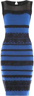 This photo is poorly lit (luckily, otherwise we wouldn’t talk about it…) and incomplete – only the dress itself. The right part is clearly overexposed. Since with overexposure all colours desaturate, and shadows vanish, our visual system has too little information to guess at the direction and colour of the illumination and ambient lighting. So in different persons the guess at the illuminant will differ, and after its “subtraction” the perceived dress colour will differ.
Interested to partake in a survey on your perception of the dress? →Here.
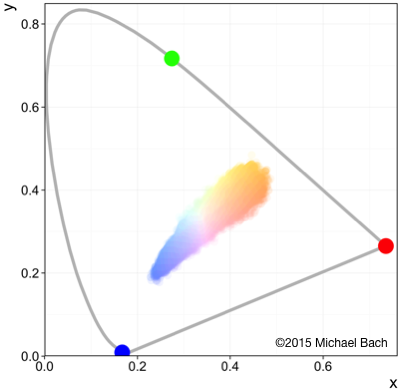
Want to see the code that produced the chromaticity colour sampling diagram above? →Here is the complete R code.
Original communication by Swiked on tumblr
My interview in German TV (1st program ARD)
Bach M (2015) Aufregung um die Farbe eines Kleides – blau-schwarz oder weiß-gold oder? Ophthalmologe 112:512–516
Witzel C, Racey C, O’Regan JK (2017) The most reasonable explanation of “the dress”: Implicit assumptions about illumination. JVision 17:1