Above there are many small upright bars which are vertically displaced following a sine-wave. The question is: do all bars look alike in height? Many would agree they don’t. You can use the right slider Compensate on the right, for me a value of halfway up is about right, no?
As you will already have guessed, they are all identical in height, but don’t look like it. If you use the left slider, the amplitude of the sine-wave can be reduced to zero, revealing the veridical height of the vertical lines.
After a Twitter discussion on this, I added the option to alternatively show horizontal stripes (uncheck Vertical).
The original authors (Day & Stecher, 1991) write in their abstract: “The illusion is explained in terms of a perceptual compromise between the vertical extent and the greater overall dimensions of the section at the turn of the sine-wave figure and is thereby held to be the same in principle as the Müller-Lyer illusion.” Hmm… When I have obtained the original article (which is non-trivial for me {and still have not been able to}) I will comment more. Whatever, the illusion is rather strong for me.
The phenomenon has occurred in my laboratory a number of times, when we were looking at visual evoked responses in the EEG. Small structures that ride on a rising or falling edge are easily misjudged in size.
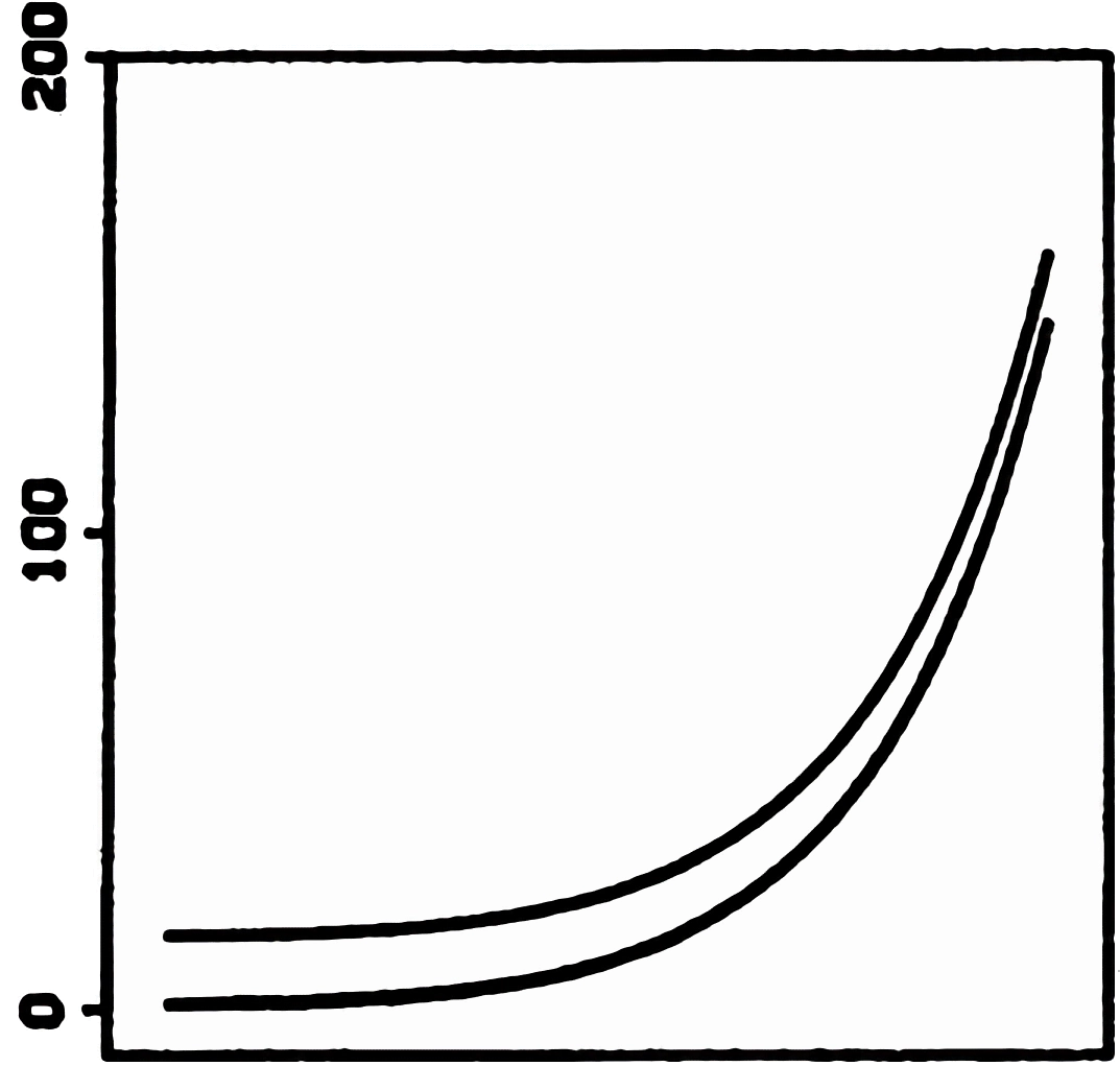
2022-11-13 Based on a kind communication by Daniel Reimann, I would now trace the first description of the basic effect to Cleveland & McGill (1984). Inspect the figure on the ←left (part of their Fig. 26): the two curves seem to get closer to each other going up – however, their vertical separation stays constant, the difference between the two is always the same. [Their top right area would correspond to the zero crossing area in the sine illusion above.] Cleveland & McGill write 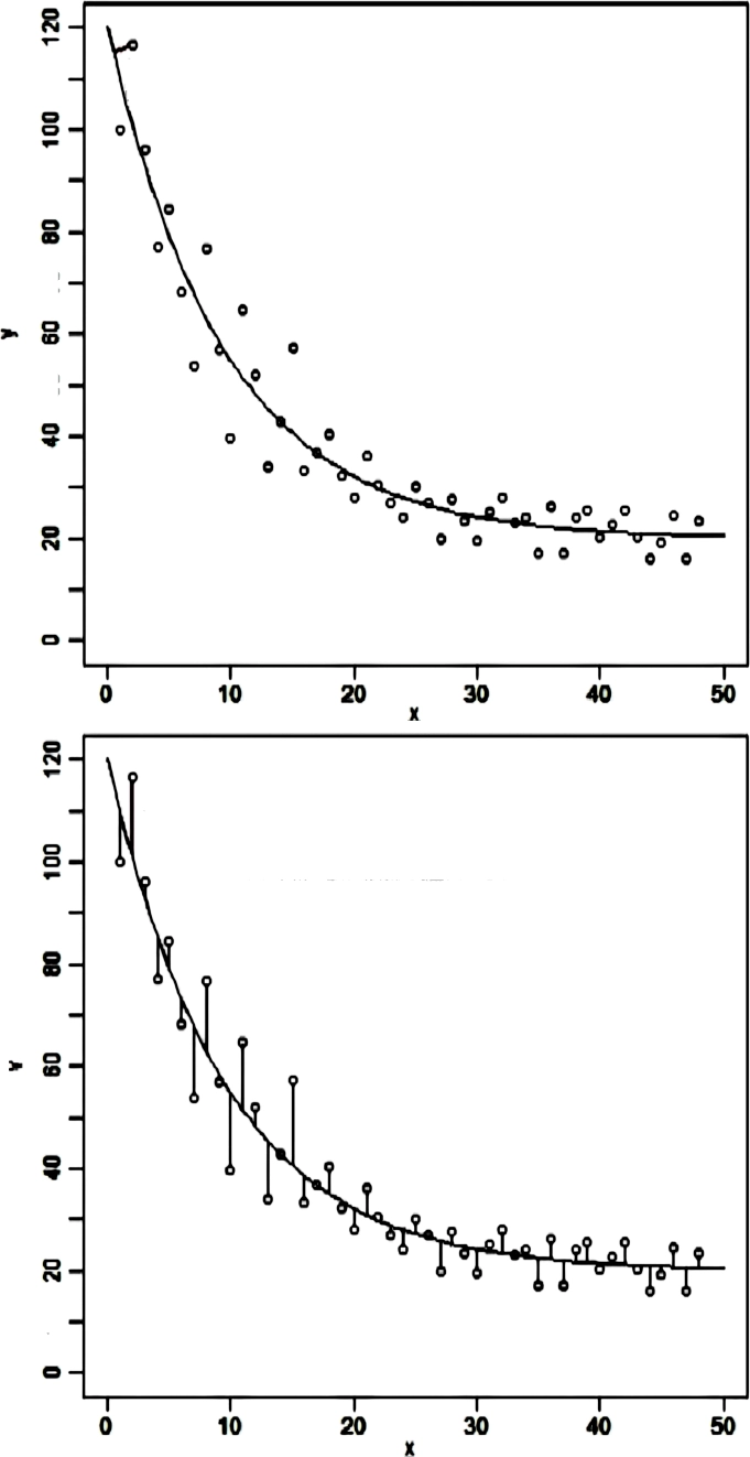
“It is almost impossible to get even a rough idea of the … differences of the curves …. The problem is that the brain wants to judge minimum distance between the curves in different regions, and not vertical distance.”
That seems an apt description and a likely explanation. “Minimum distance between the curves”: a little like the brain performing a Deming regression. The problem also occurs when we try to judge the vertical distances of points from a fitted curve. Reimann et al. (2022) suggest what they call “lollipops” –vertical lines connecting data points– to reduce misleading effects (on the right→ a modification of their Fig. 1). With the lollipops, it becomes apparent that the scatter between points on the top left is wider than at the bottom right; they support this with experimental data.
When switched to horizontal stripes, there is no size illusion, but a strong 3-D suggestion instead (but that’s another story…).