
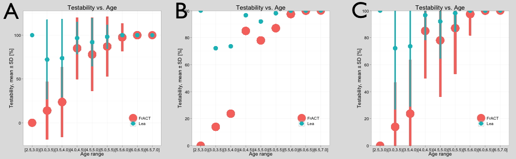
So I was plotting something with beautiful ggplot2 and added error bars with geom_pointrange (yes, it doesn’t make sense to calculate SD on a % scale, but that’s for another day), result in A (left). So far so good. Since it was a % scale on the ordinate, I amended scale_y_continuous like so:
scale_y_continuous(name=”Testability, mean ± SD [%]”, limits = c(0, 100), expand = c(0, 0))
resulting in (B). Great, the ordinate now nicely runs from 0 to 100%, but why are the error bars gone? That stumped me for hours; I even came close to suspecting a bug in ggplot, unlikely as it is. Then I talked to my colleague Daniel, who found the solution: If you limit the scale like that, you remove all data points outside the given range, so the error bars are not clipped but considered off-scale and dropped completely! The solution is to not use “limits” in scale_xx_continuous but add this:
coord_cartesian(ylim = c(0, 100))
That only affects the appearance of the axis, like I want it, as seen in C.
Now, after the fact, I know: Yes, it’s in the book, but still for those like me while having read it, several times, but still haven’t digested every thing, this might save you some of your time.