
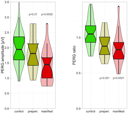
I’m just finishing the manuscript of our latest electrophysiology-in-glaucoma findings and wonder if this plot is just for show or adds real value. To note: the violin plot renders the density and thus has some things in common with a notched box plot, so I overlaid the two. And I find this, really, beautiful. This is not the place to discuss the scientific implications, but the more I think about it: it does add value, and beauty never hurts. So I’ll leave it in the ms – let’s see how it fares with the reviewers ;-).
Whatever: I am happy that ggplot in its latest incarnation sports notches when desired, and the violin plots will find their proper place once the novelty factor is over.